Gini coefficient

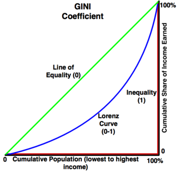
The Gini coefficient measures the amount of income inequality in a given country or region, when measured, a group with a coefficient of 0 has complete equality whereas a group with a coefficient of 1 has total inequality.[2]
Complete inequality means that the group with the highest incomes earns the whole of the share of income earned, one group has all the money. Complete equality means that there is an equal distribution among income levels and the amount of the total income that each group possess. The graph in figure 1 shows what perfect equality and perfect inequality look like. Real countries have a curve (called a Lorenz curve) that is somewhere between the two. The more the Lorenz curve sags, the worse the inequality is within a country.[2]
Note: The Gini coefficient falls between 0 and 1, when indexed, the number is converted to fall between 0 and 100 and should be thought of as a percentage.
GINI Around the World
The map below shows the Gini Index (0-100) number of each country.
Note: There are data missing for some countries.[3] Hover a mouse over a country to get it's Gini Index.
Notice that OECD or "western" countries such as the United States do not always have the best Gini coefficient despite their relative wealth.
References
- ↑ Created internally by a member of the Energy Education team.
- ↑ 2.0 2.1 "A Dictionary of Economics" published Oxford University Press, 2013. Edited by John Black, Nigar Hashimzade, and Gareth Myles Online version accessed [August 17th, 2017].
- ↑ Map made by a member of the Energy Education team with data taken from: Central Intelligence Agency: World Factbook. "Country Comparison: Distribution of Family Income - GINI INDEX." [Online], Available: https://www.cia.gov/library/publications/the-world-factbook/rankorder/2172rank.html, [May 22, 2016].

