Energy use per person
Energy use per person is a per capita expression of how much energy use there is in a given country or area. While the world population is increasing quickly, the total primary energy use is increasing faster much faster. Even faster than this, the total electricity use around the world is increasing. These increases can be tied to the fact that the energy use per person is rising in the world, as is the power use per person. This increase is not uniform worldwide, rather energy use per person is rising more rapidly in some countries than in others.
People who live in wealthy countries tend to be the people most likely to live in a high energy society - and these wealthy countries are often taken to be OECD countries.[1] Wealthy countries have extensive energy infrastructure, like the electrical grid, to give citizens access to energy currencies to provide extensive energy services that allow them to maintain a high quality of life. Developing countries, especially BRIC countries, have a rapidly growing consumption of primary energy in attempts to improve their economic opportunities.[2]
Power Servants
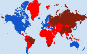
A person gets energy from food at a rate of roughly 100 W of power, averaged over a day.[3] This value of 100 W provides a way of quantifying the rate of energy use (power is the rate of energy use) that's personal. Since this 100 W consumes primary energy at the same rate a person does, 100 W can be thought of as a power servant - also called energy servant.[4] The average power consumption is 20x the power that a power servant can put out, on average, so that's 20 power servants. The power consumption in OECD countries use 50 power servants. Canada uses approximately 110 power servants. On the other end of the spectrum, non-OECD countries use 14 power servants.[5] Explore the data visualization tool in Figure 1 to see how power use varies from country to country.
Data Visualization
Figure 2. Primary energy use in OECD (blue) and non-OECD (red) countries, see the map in figure 1 for which countries are part of OECD. Use the dropdown 'compare by' in order to look at countries, and the 'country selection' to look at particular countries. Click the 'per capita' to see total energy use of these countries.
References
- ↑ OECD. (November 11, 2015). List of OECD Countries [Online]. Available: http://www.oecd.org/about/membersandpartners/list-oecd-member-countries.htm
- ↑ Uwe Becker. (November 11, 2015). BRICs and Emerging Economies in Comparative Perspective : Political Economy, Liberalisation and Institutional Change, 1st Ed. Taylor and Francis, 2013.
- ↑
- ↑ R. Wolfson, "High-Energy Society," in Energy, Environment and Climate, 2nd ed. New York, U.S.A.: Norton, 2012, pp. 20–21
- ↑ BP Global. (November 11, 2015). Statistical Review of World Energy [Online]. Available: https://www.bp.com/en/global/corporate/energy-economics/statistical-review-of-world-energy.html


